Söderberg & Partners: Iterative UX
Client
Söderberg & Partners
My role
UX/UI, workshop facilitator
Project time
Sep 2024 – Jun 2025 (initial project) & ongoing
Tools
Figma, Miro
Focus
Strategy, UX, user research, user testing
During the initial project, I focused on critical conversion paths. Through user testing and a structured Design Sprint, I streamlined contact forms and booking flows to lower barriers to entry.
A key insight from the research was that users perceived contact forms as "black holes," causing frustrations as they mostly never knew when, or if, they would receive a response. Therefore, we prioritized fixing these flows to set clear expectations and build trust.
The success of these validated improvements unlocked further investment, allowing us to expand the scope. This led to the development of advanced tools like a new salary calculator and contact flyout, making complex information accessible. The collaboration has since evolved into an ongoing partnership.
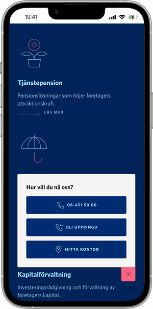
Contact flyout designed to keep help always one tap away.
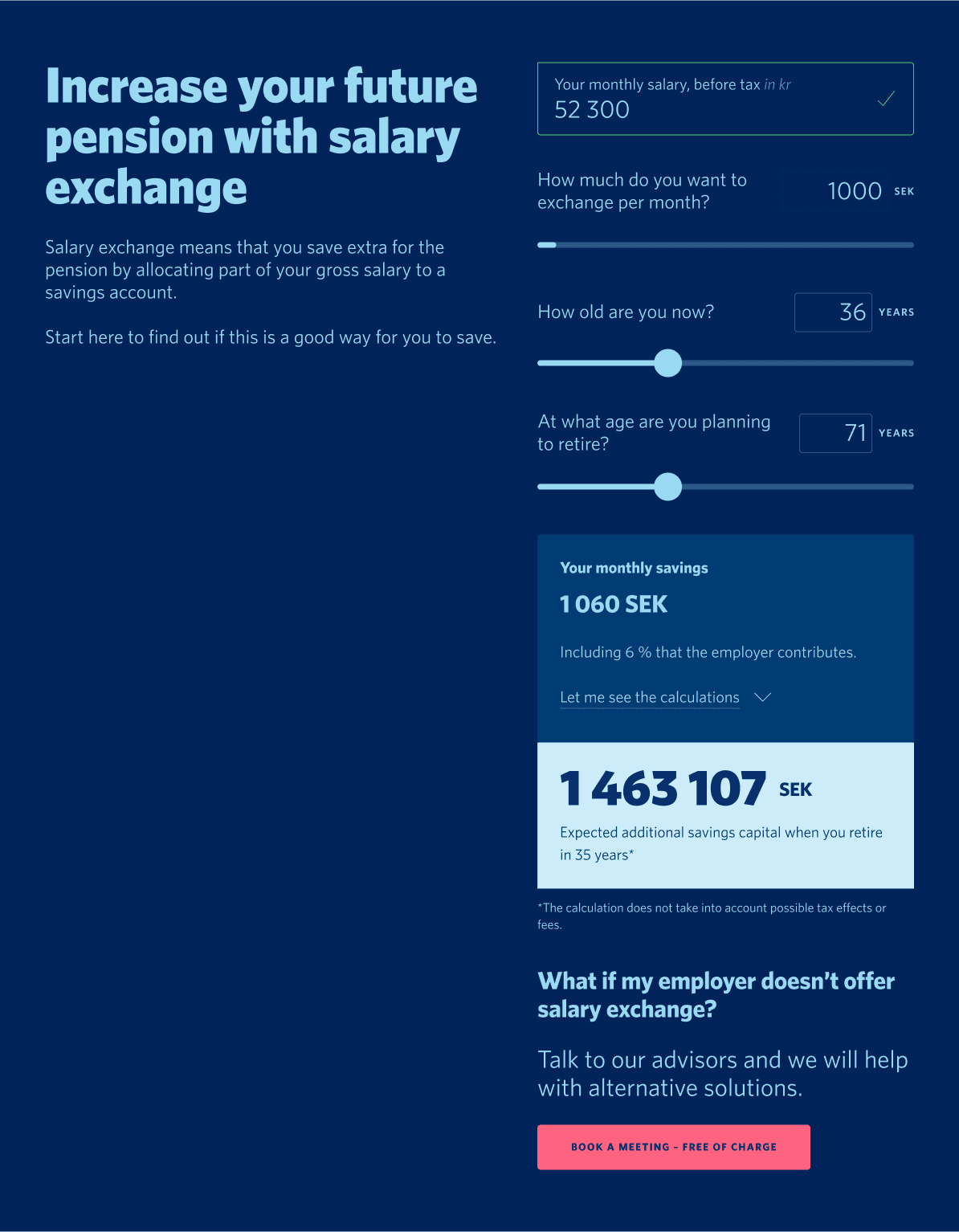
Salary calculator interface on tablet.
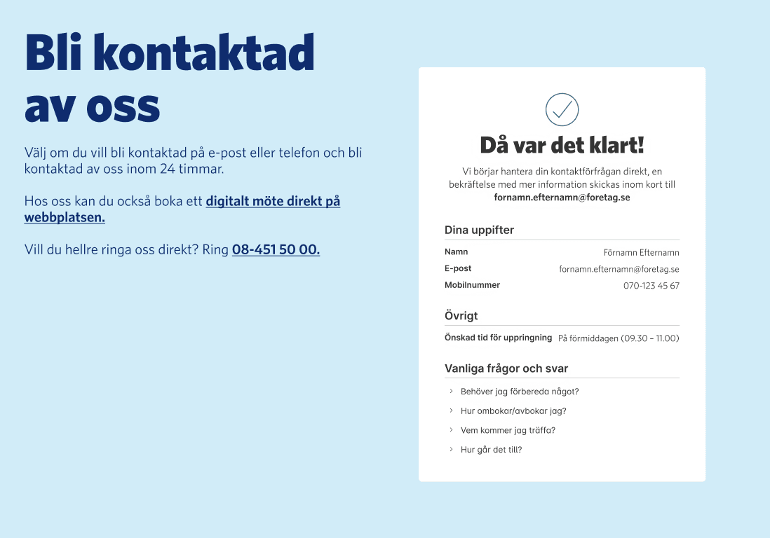
Confirmation screen designed to provide immediate feedback and clear next steps.