Coor: Redesign of 13 websites
Client
Coor
My role
UX/UI, workshop facilitator
Project time
5 months
Tools
Figma, Miro
Focus
Strategy, user research, multi-brand experience
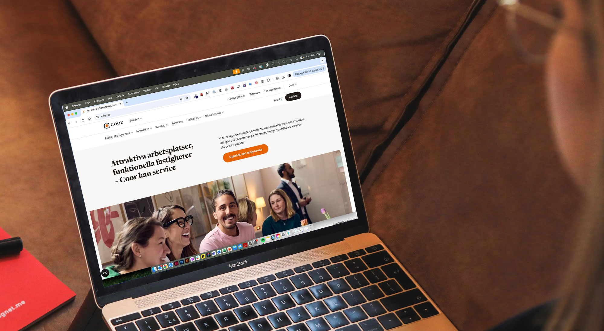
Coor is one of the leading facility management companies in the Nordics. Their digital platform had become outdated, inaccessible, and difficult to maintain across their 13 sites.
I played a key role in the pre-study where we conducted interviews and a survey with Coor's users, analyzed the results and defined patterns.
The result included an improved, intuitive navigation, and WCAG compliance over the whole web while still keeping their brand colors, such as orange.
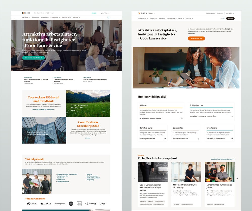
Before and after of Coor's start page.
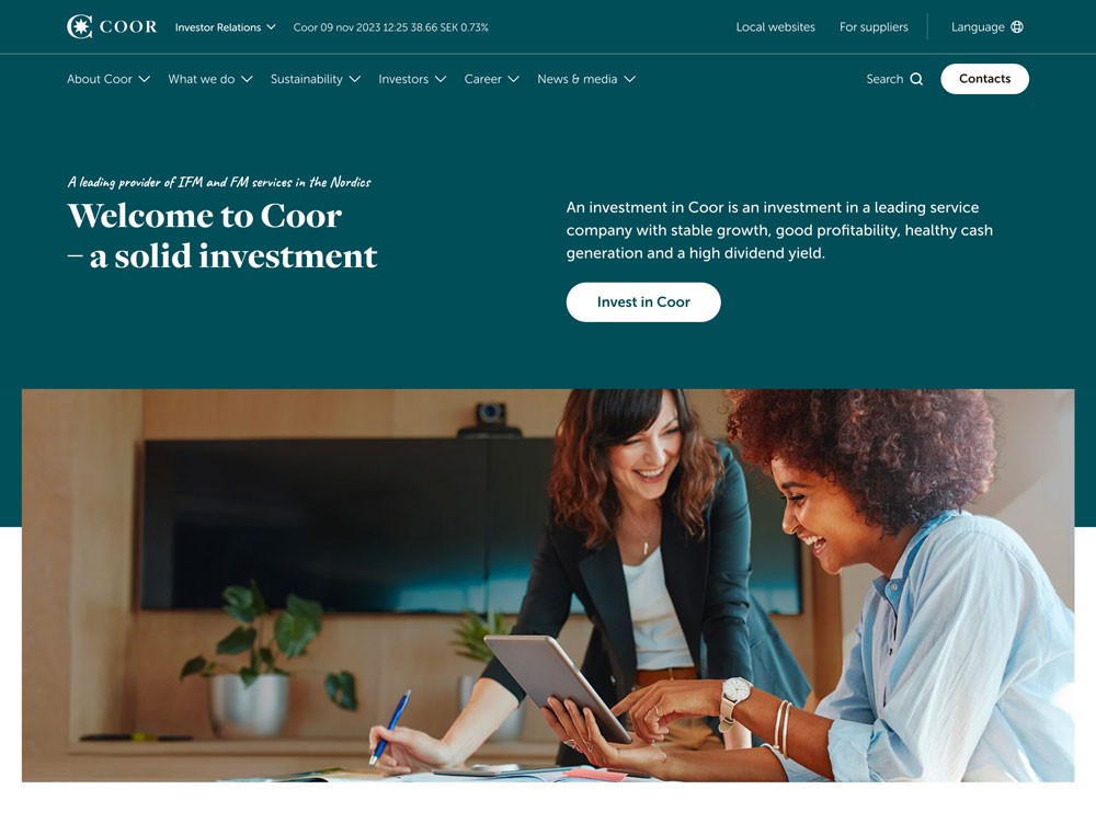
Coor's investor start page (coor.com).
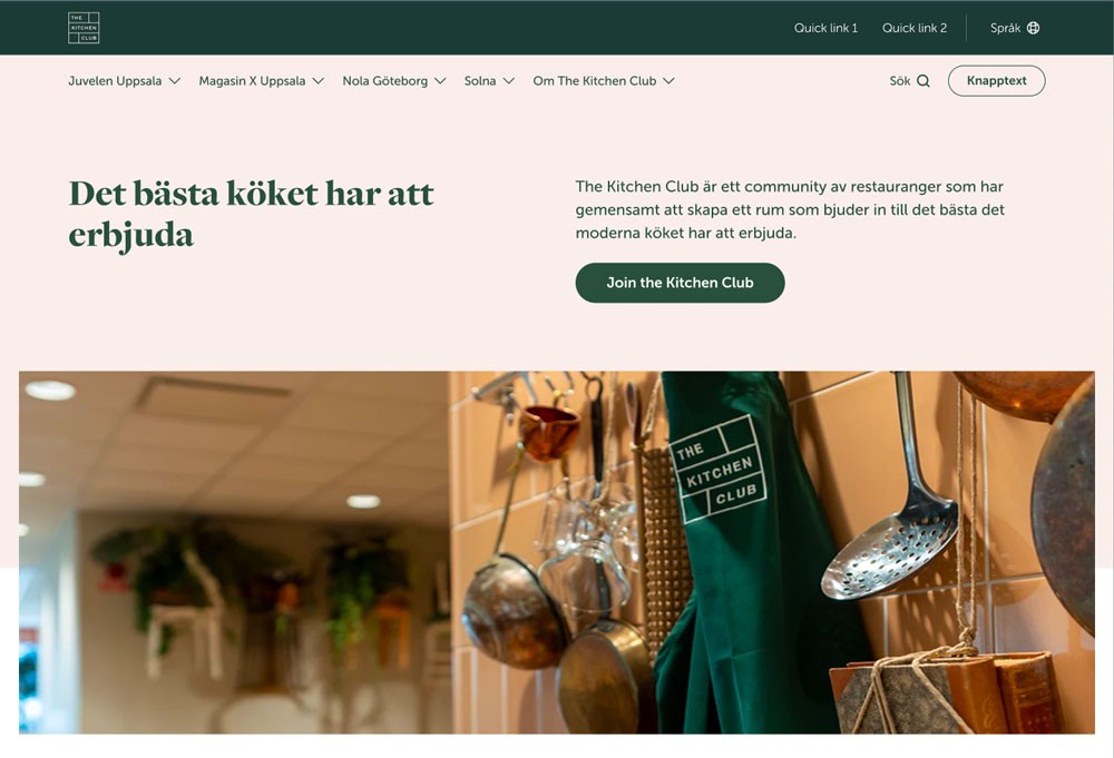
The Kitchen Club, one of Coors' brands. Same platform, different styling.
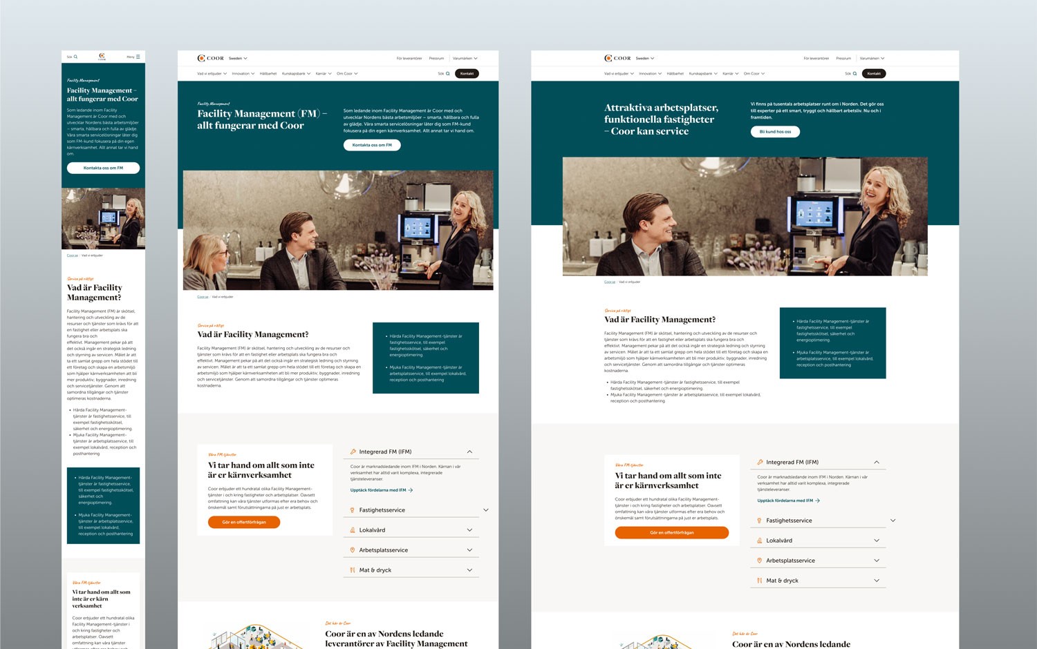
Responsive overview of a landing page. I provided a suggestion based on Coor's content, together with recommendations.
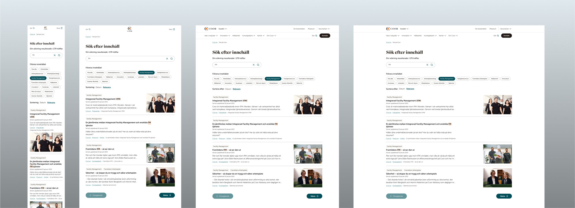
Responsive overview of Coor's search pages (MVP).