
Attendo: Clearer unit pages for three brands
- Client
- Attendo, Viljan and Unika
- My role
- UX/UI, product design, brand guardian
- Project time
- Dec 2025 – ongoing
- Tools
- Figma
- Focus
- UX, UI, product design, accessibility
Since December 2025 I’ve worked as UX/UI and product designer for Attendo and its brands Viljan and Unika, improving their websites and how users interact with them.
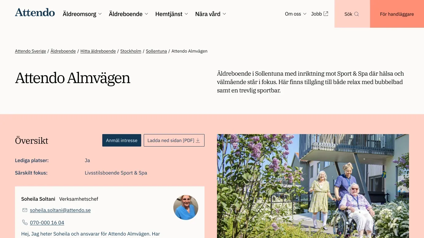
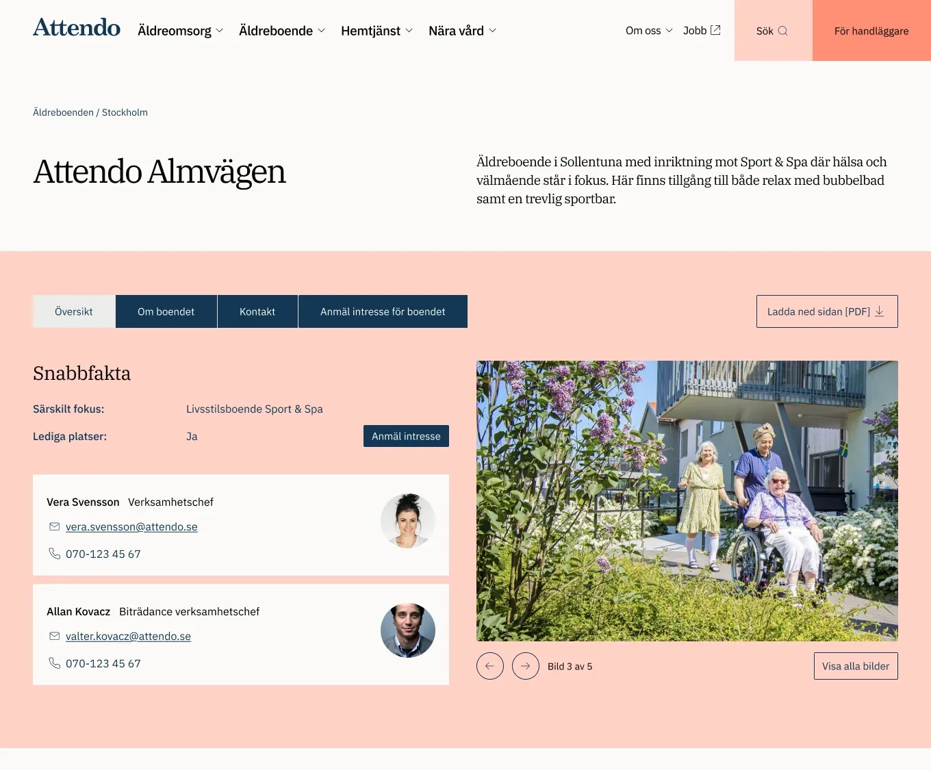
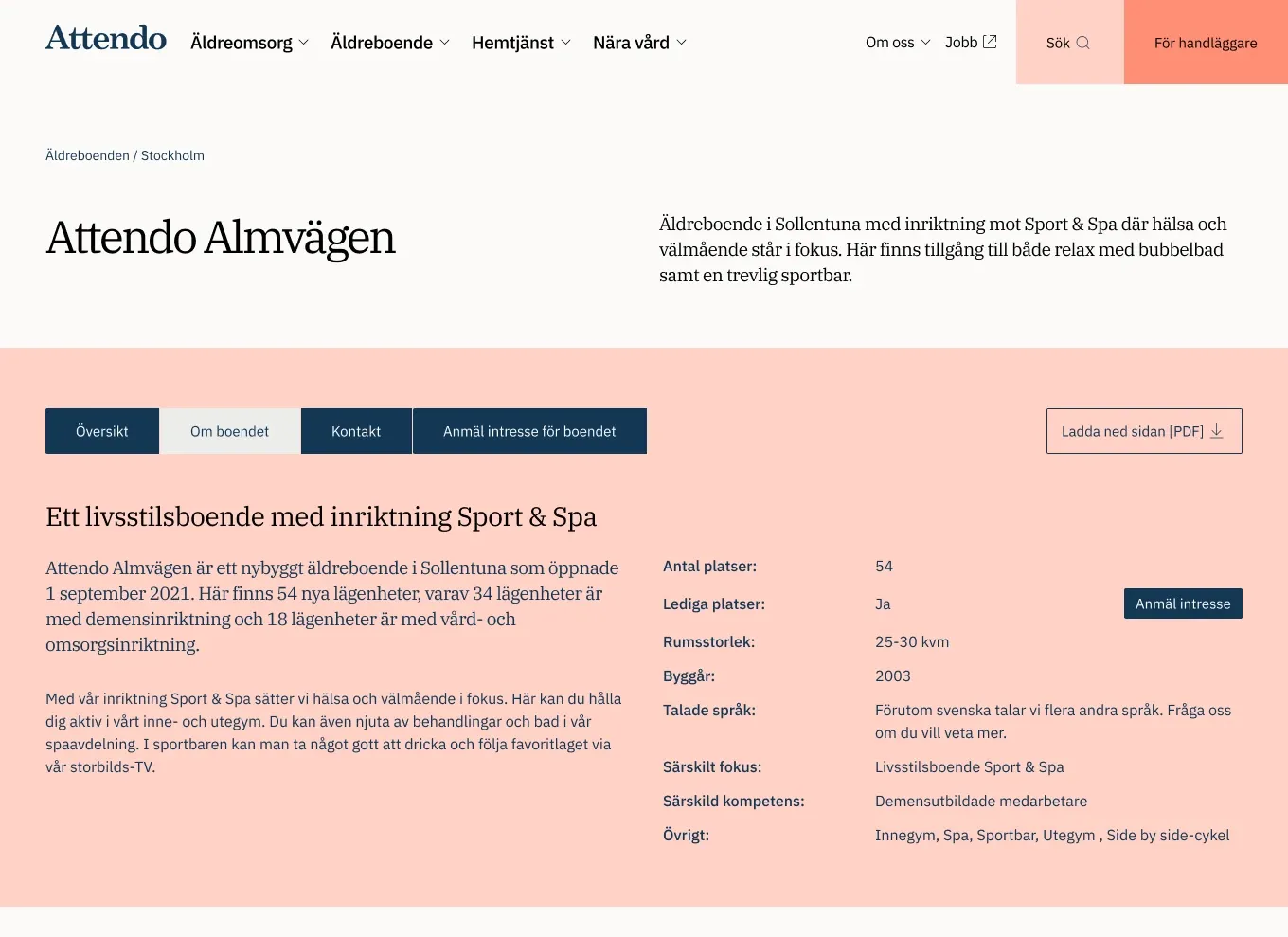
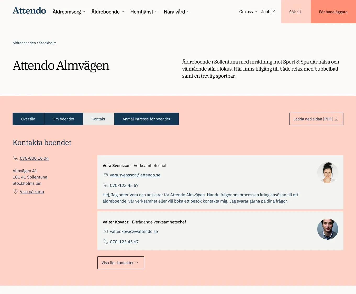
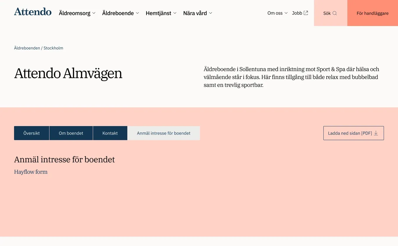
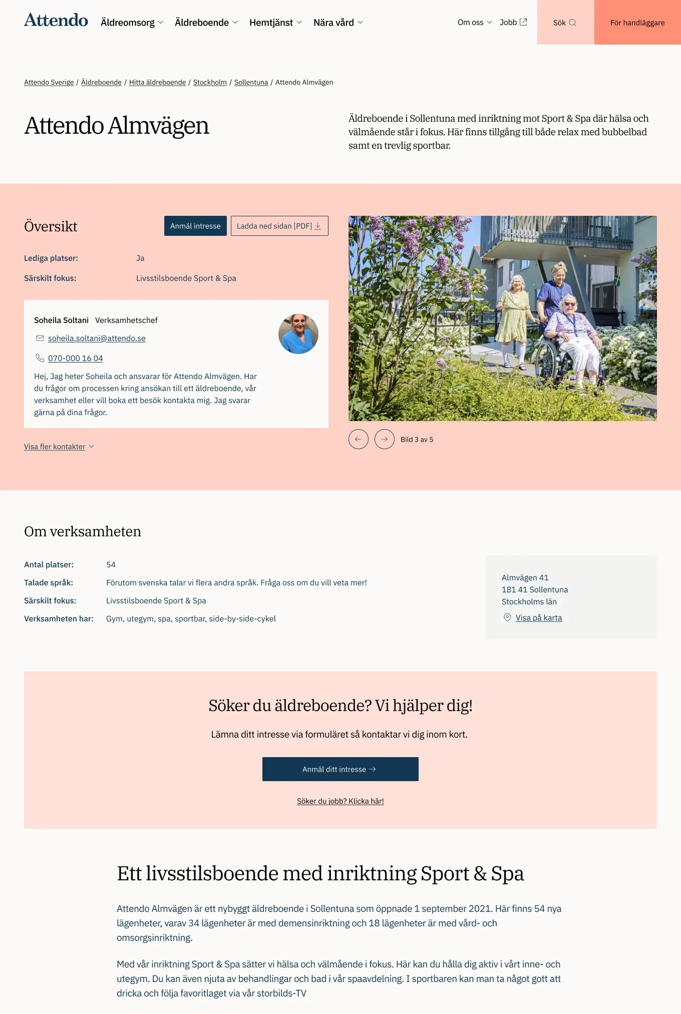
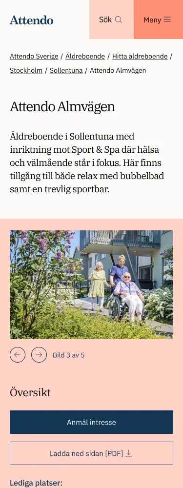
The biggest change so far is a redesign of the unit pages, now live. Heat maps and other analytics showed that visitors weren’t using the pages as intended: they didn’t find what they were looking for. The content sat in tabs that were used in an unclear way. Since most visitors are 50 to 60 or older, I suggested a linear approach instead, with all the content in one clear order.
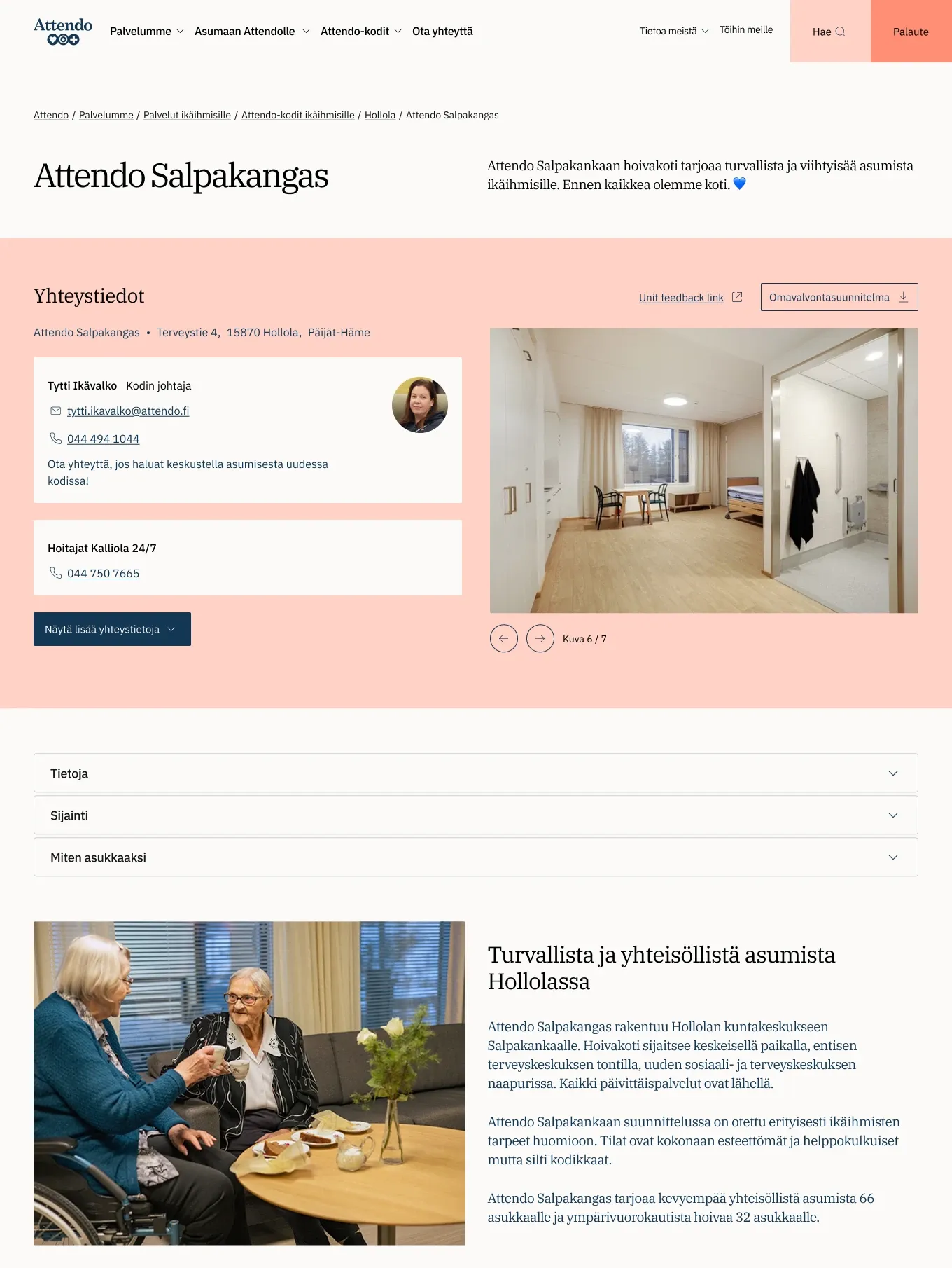
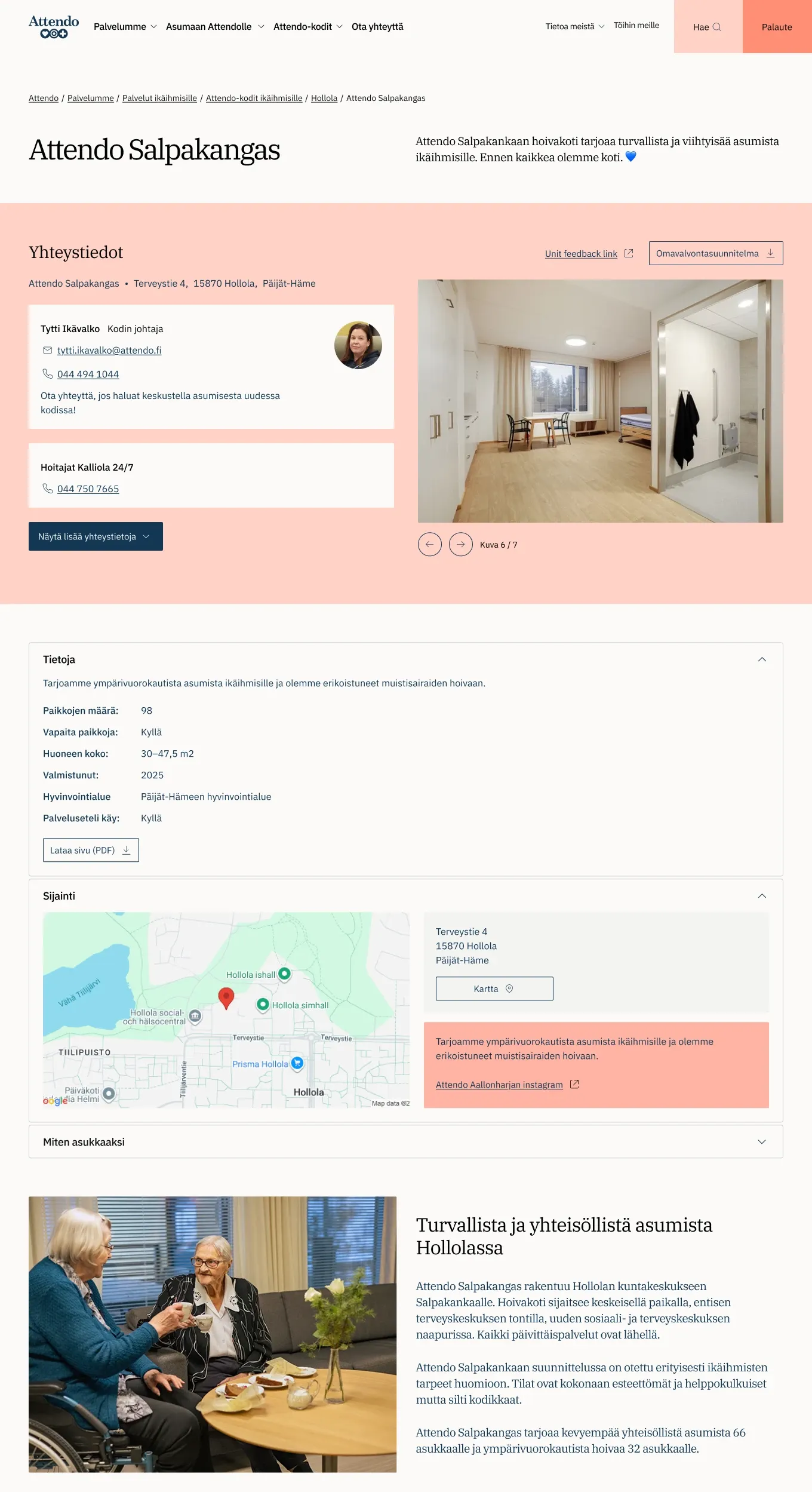
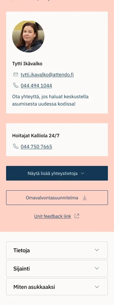
The two markets wanted it slightly differently. Sweden kept every section open, while Finland wanted accordions, to tuck away information that isn’t as important to Finnish visitors as it is in Sweden. The new design also needed far fewer screens than the tabs did, as we worked closely together on it.
Alongside that I’ve designed printed PDFs for the web, acted as brand guardian on a price calculator, and designed a new unit listing for Viljan that launches soon.
Key takeaways
Let the data show the problem
Heat maps and other analytics showed that visitors didn’t find what they were looking for on the unit pages.
Design for who actually visits
Most visitors are 50 to 60 or older, so one linear page made more sense than tabs used in an unclear way.
One structure, two markets
Sweden wanted everything open, Finland wanted accordions for content that matters less there. The same linear page handles both.